Product design for web service Andcards
Web design, brand identity
Andcards is a technology company that makes apps for coworking spaces. Shared office space tenants use their coworking software to get the most out of their workspace.

Goals and challenges
Andcards contacted Gram as soon as they started implementing their marketing strategy. Their goal was to set themselves apart from competitors and get clear visual communication and brand positioning.
They wanted to get rid of the “startup company” label, which often comes with white and generic vector illustrations, overused by major companies in this industry.
Briefing
Before creating visual communication, we had to research our target audience. Following up on the company’s stakeholder’s insights, we created a detailed image of our buyer persona.
Our client is Roger, who is 35 years old. He owns a coworking business. Compared to other competitors in the niche, Roger’s business offers various innovative services and positions them as premium.
His goal is to build a significant business, increase revenue, and make his brand more recognizable. He understands that by embracing innovations, he will grow his business in the long run. Roger is also empowered to deliver a top-notch customer experience to his clients because their business success directly impacts his business success.
Roger views and approaches his coworking, not as the regular generic business in this niche. His point of differentiation consists in providing coworking members with an outstanding experience. He is always searching for all possible ways to bring “magic” to his business and make it stand out from the crowded market of lookalikes. Roger never underestimates the value of innovations, customer care, and solutions that are fine-tuned to his customers’ needs.

Defining tone of voice
Before creating visuals, our task was to build a communication strategy. For this, we used a well-established marketing tool called “brand archetype.” According to Carl Jung, a renowned psychologist, humans use symbols to understand complex concepts. Brand archetypes serve to reflect brands and services’ personality and help different personality types fit specific Buyer personas.
We managed to harvest significant insights by interviewing the company stakeholders, reviewing competitors’ communication strategies, and conducting buyer persona research. Based on these insights, we chose the Magician archetype that would become a leading character that impersonates and establishes the connection with the buyer persona.
The values behind this archetype are aligned with the values of the buyer. The magician’s identity is driven by the desire to create something unique and make dreams come true. He is endowed with visionary and spiritual power. (Brand examples: Apple, Disney, and Absolut).
In addition, we chose the Caregiver archetype as the secondary archetype to complement the brand communication. This character protects and cares for others, is compassionate, nurturing, and generous. He impersonates administration staff who is always involved in the purchase decision-making process. (Brand examples: Johnson & Johnson, Campbell’s Soup, UNICEF).
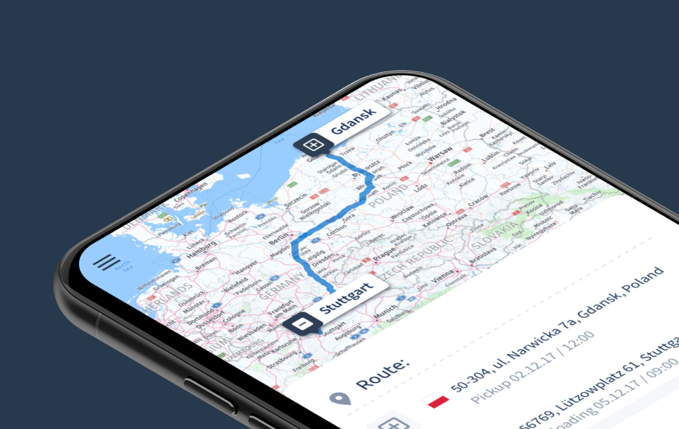
Member-first
Andcards’ application is designed to provide the coworking members with the above-and-beyond workspace experience. That’s why it’s a members-first application. We transformed this powerful insight into a distinctive visual identity. Our team created an elegant, sleek, and polished app design that puts coworking members at the heart of the brand.
Style elements that help stand out
To implement the communication strategy and reach the target audience, Andcards had to position its brand as premium with a slight focus on customer care. We thoroughly researched and defined the basis of the brand identity – the color gamut. It gave the app a premium look and feel. We made all graphic elements resonate with the brand values to strike the right chord with the target audience.


The website
Bold typography, well-considered colors, properly used accents, and photography – all these elements roll out on the intersection of website and user experience and help the brand stand out.
Modular composition served as the base for all design components. We applied the same component-based framework to images. It makes the photos easy to perceive and facilitates the entire design and communication workflow in the long run.


Intuitively designed blog
The blog is one of the main customer touchpoints. That is why it should be always associated with the brand. The modular framework, that we used for creating the website layout, came in handy for designing the blog. It enabled us to implement the intelligent use of space and preserve the visual identity.


Marketing materials
As part of our collaboration with Andcards, we created a significant number of branding and marketing deliverables for the company.


Gram
Strategy director: Oleksandr Topolnytskyy
Research & Visual strategy: Andriy Lebediev
Brand identity & Concept & design: Mykhailo Kuspys
Check our other digital product projects