Product design for digital platform Copecart
UI / UX, web-service, mobile app, brand identity, web design, marketing materials
CopeCart is an online-based platform that offers automated solutions for selling digital and physical products and services. The company’s mission is to simplify online commerce.
Our cooperation with CopeCart contributed to a range of usability refinements of the service functionality and new feature designs. Besides, we have revamped the company’s visual identity by developing the brand identity guidelines that feature some new visual elements and by creating a holistic approach to brand visuals.

UI/UX for the Web Service
Together with the CopeCart development team, we made usability refinements of the service functionality and created the design of new features that include but are not limited to improved order processing and innovative dashboard design with KPIs that would help businesses get more profitable.


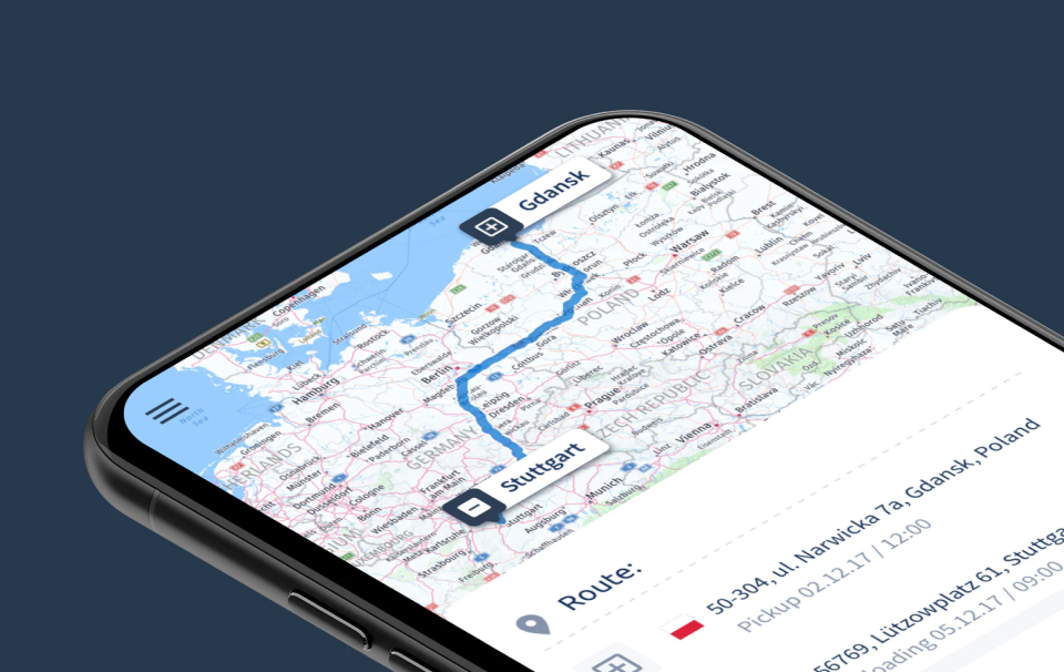
UI/UX for the Mobile Application
With the mobile application, users can access all the dashboard’s functionality and harvest all business-critical insights.
To align with the company’s mission of simplifying things, we used a minimalistic approach to reduce the visual noise and help users focus on the main KPIs.
We located most of the navigation elements at the bottom and made some interactions gesture-based, making app usage fast and pleasing. Together with the product stakeholders, we implemented gamification in the app to keep users even more engaged when running the application.


Brand identity guidelines
Collaboration with the people who created and promoted the product shaped our vision on how the brand would look and feel. We picked two words to frame it: simple and purposeful.
This brand identity guide helps maintain a coherent, consistent brand’s visual appearance in both the digital and real world.

Web design
Because of the number of elements the homepage and blog contain, they shape our perception of a brand. Their look should communicate company values and vibes.
We managed to achieve it by a visually-appealing composition of the webpages, the dominance of vibrant corporate blue color, crisp contrasts, properly used accents, and new corporate illustrations.
On top of that, we thoughtfully arranged the elements for a more well-balanced informational hierarchy.


Illustration set
We developed new illustrations to convey simplicity, playfulness, and lightness in the brand’s visual communication. We also created a set of images based on our style and attributes research.


CopeCart digital events design
CopeCart is actively creating and working on its events and courses dedicated to digital sales.
Promotional pages and materials need to stand out, which requires a masterful approach to designing them. The design needs to possess the company’s vibe, and it should resonate with the emotions of the company’s events. For this, we designed a series of landing pages and made custom illustrations, icons, interface elements for every event.


Read about our other projects in digital product design