Sweet Sweets. Brand identity
Brand strategy, naming, descriptor, identity

Have you ever imagined a world where all the sweets you love are gathered in one place — so you don’t have to hop from store to store just to build your perfect treat box? Whether it’s for cozy evenings with a good TV show or to make sure every family member gets the cookie they like best.
Sweet Sweets: caramel caramels, chewy chews, jelly jellies, chocolate chocs, pastry pastries — and simply sweet sweets. Because what more do you need for simple, everyday joy?
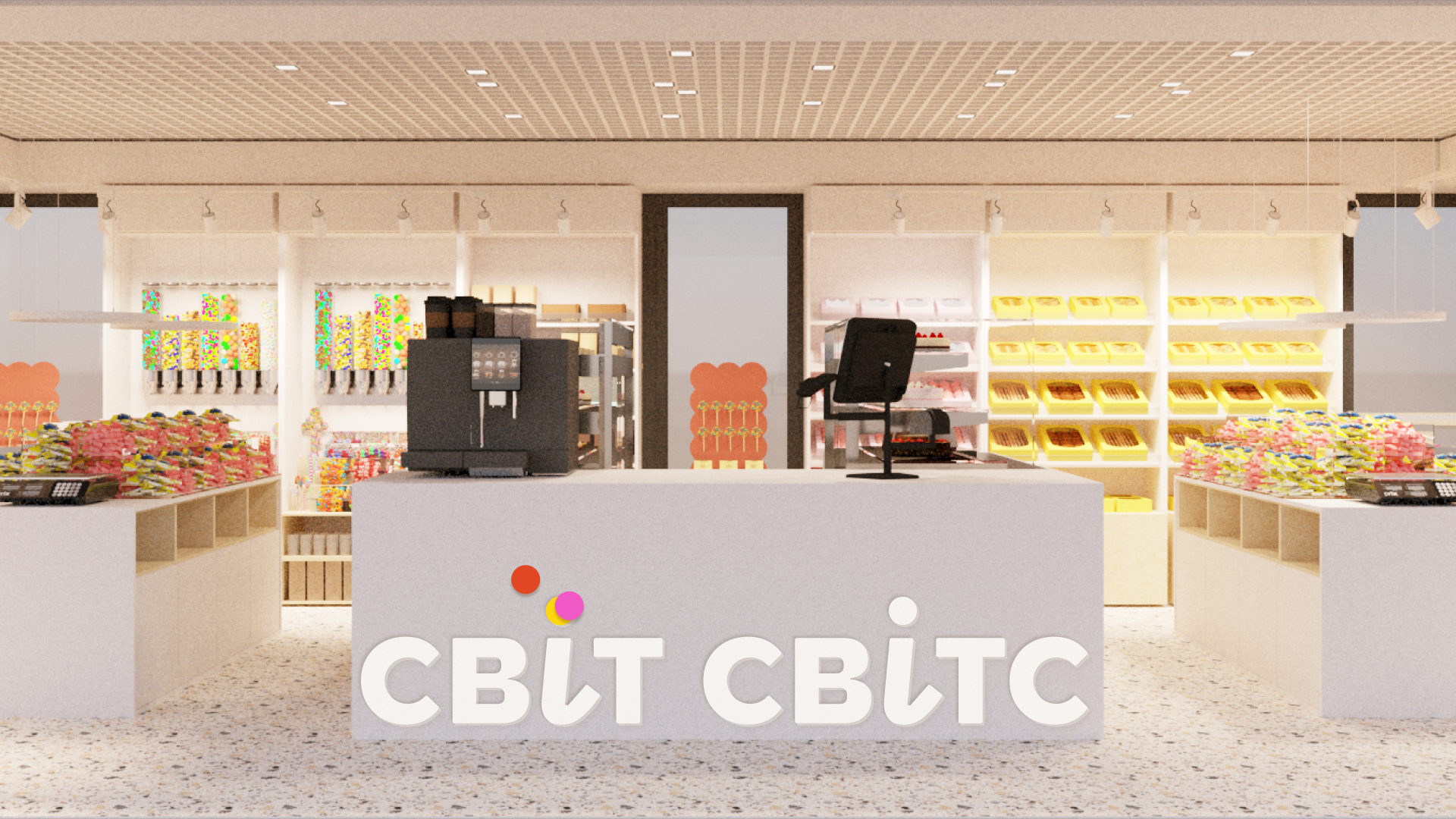
Sweet Sweets is a multibrand chain of candy stores. Our goal was to create a place that’s accessible, both geographically and price-wise. A place that’s always nearby, so you don’t have to plan a special trip to a specialty shop. A place that takes care of you. Because that’s one of the core values of the brand.
Often, we walk into a supermarket not exactly knowing what we want — we’re searching for something special, but not too fancy, not too complex or expensive. Something simple and everyday. The idea of bringing people small, everyday joys became the foundation of the brand strategy and was reflected in the visual identity.
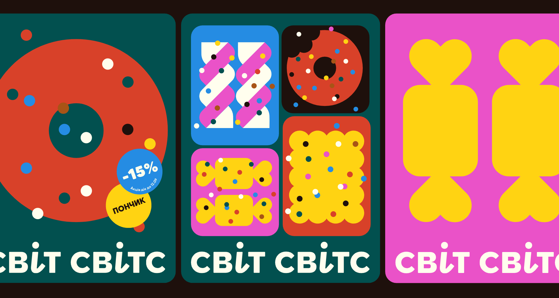
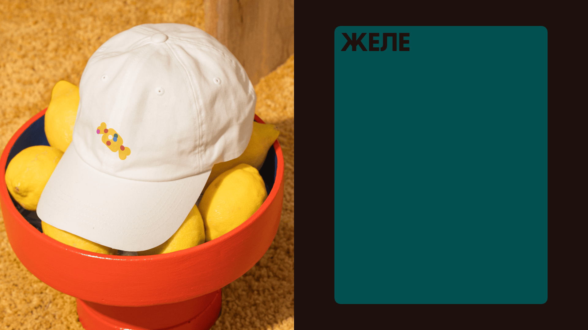
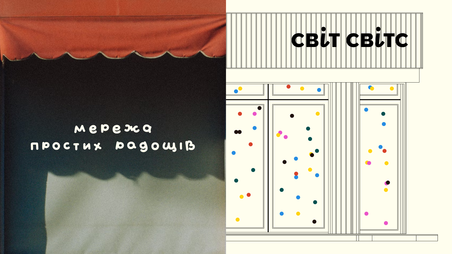
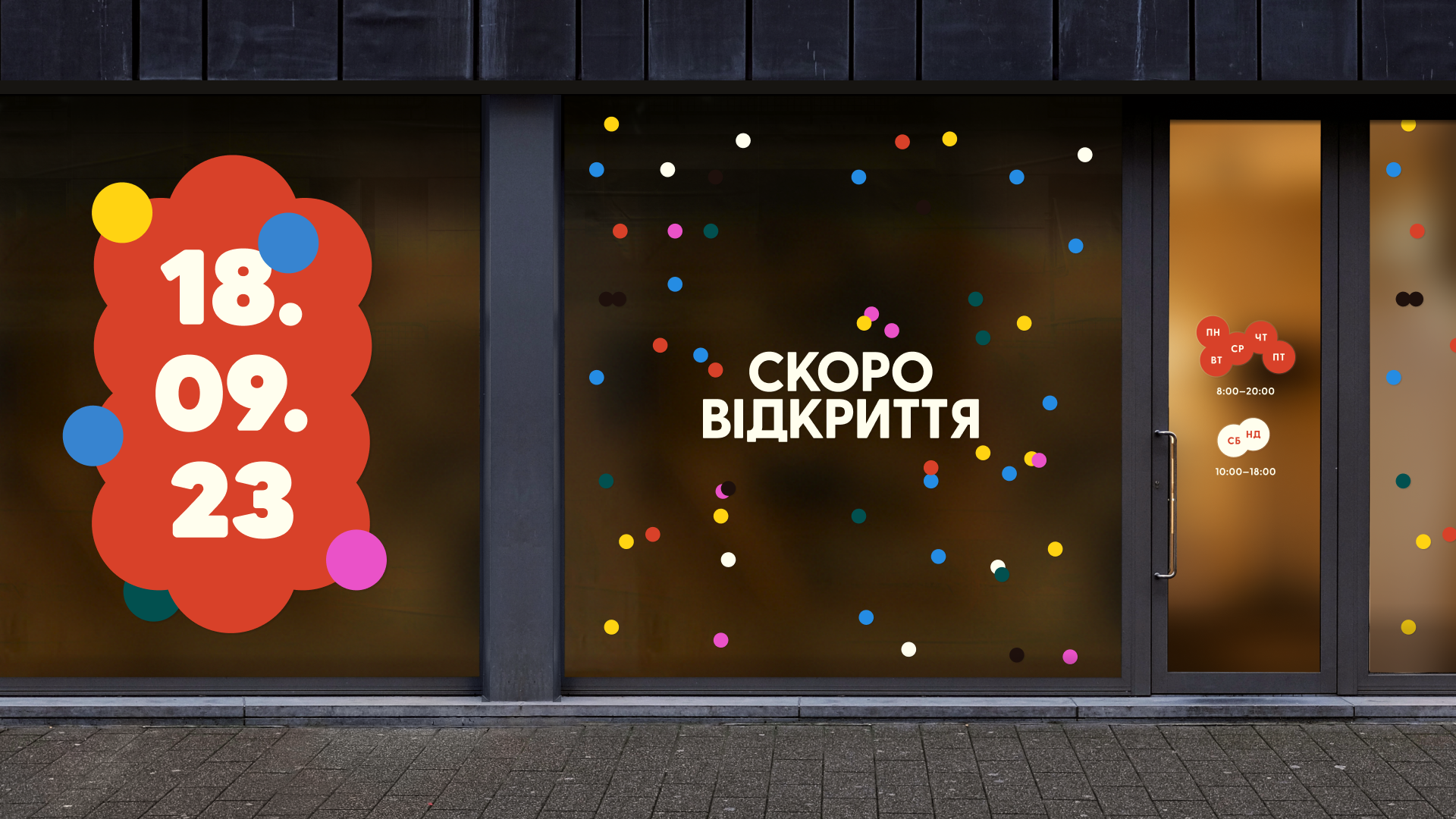
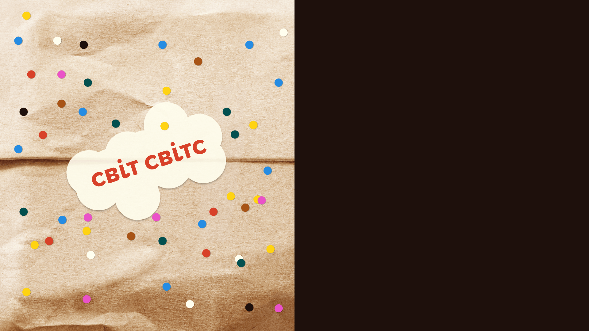
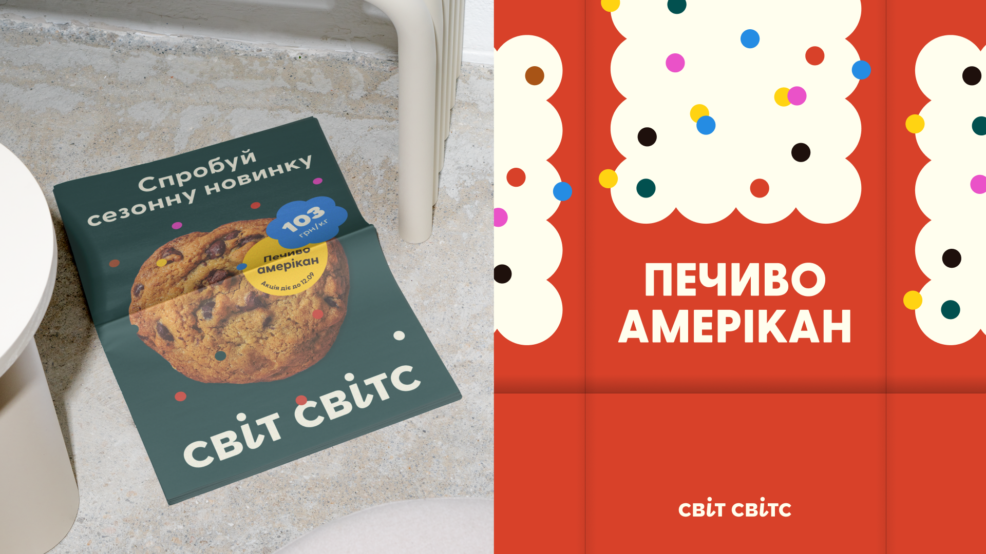
To express this idea visually, we searched for a very simple way to convey joy — something familiar, emotional, warm, and unifying. This metaphor became confetti: simple to implement in a design system, easy to reproduce, instantly recognizable, and always appearing in the most unexpected places.
We created playful lettering for the logo and added a quirky twist by slanting the ‘i‘ letters and giving them curled tails. We also sweetened our sweet story with a mix of graphic gingerbread cookies, candies, jelly shapes, and a handwritten descriptor — “Home of Simple Pleasures”. These were scattered throughout the identity — just like confetti!

Project team: Oleksandr Topolnytskyy, Anna Vyrstiuk, Nazar Yaremchuk, Yuliana Kovaliuk

