ARGON. Rebranding
Brand Identity, design-system, rebranding

Argon is a multi-brand store specializing in professional welding equipment.
To make the rebranding and user-friendly design-system truly successful, we conducted market research and in-depth interviews with the target audience.
This helped us understand the core value of Argon—the people behind the brand.
The company’s managers and executives are always in touch, ready to find the best solutions, and genuinely care about their clients.
They know their customers by name and will even call to wish them a happy birthday. In return, their clients can always count on favorable terms and fast order fulfillment.

This core value became the foundation of the visual identity. And we realized—we needed a main character!
That character became the dragon, as it was already part of the brand identity but had played a secondary role.
Previously, it had a cartoonish and somewhat naïve appearance that didn’t fully reflect Argon’s character. It was mostly used on stickers, merchandise, and promotional materials.
When refreshing the identity, we knew we wanted to keep the dragon. Clients had formed an emotional connection with it, and it had become a recognizable symbol of the brand. However, its previous style didn’t align with the company’s values.
So, we set ourselves an ambitious goal—to keep the dragon but redesign it in a way that would immediately convey the brand’s essence.
The dragon has now “grown up” and become a strong, serious protector—one that helps welders solve their toughest challenges. It frequently appears as a complement to the logo and across brand materials, symbolizing reliability and support.
This same idea is reinforced by the new descriptor and slogan:
Argon – Your Welding Partner. Always Nearby, Always Reliable.


The bold, uppercase letters give the logo a strong and uncompromising presence. The custom curves within the letters visually reference welding, particularly argon welding, which is considered the pinnacle of welding craftsmanship. The seams created in this process feature a repeating circular pattern, which we echoed in the letterforms with smooth, intricate cutouts.
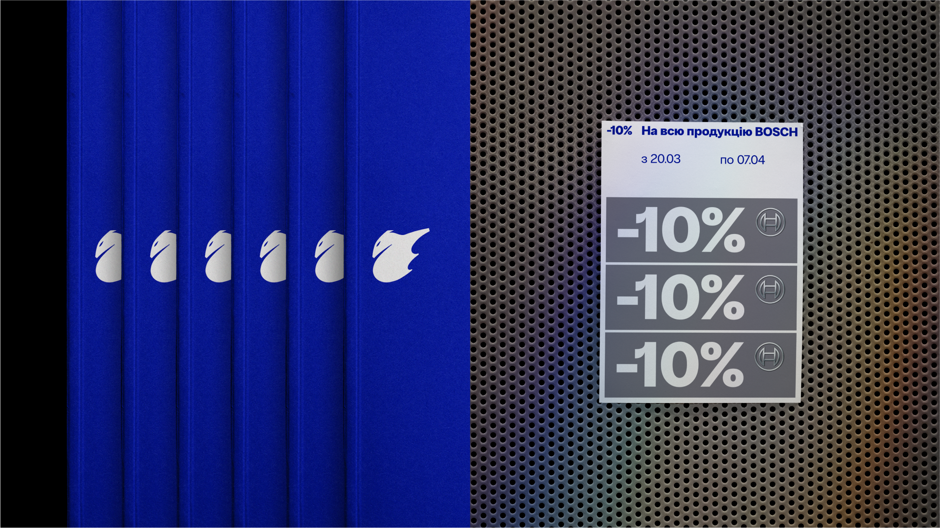
We also introduced a grid pattern as an additional identity element, inspired by the metal grid walls used in professional tool and equipment stores to display products.
We also introduced a grid pattern as an additional identity element, inspired by the metal grid walls used in professional tool and equipment stores to display products.


Project team: Oleksandr Topolnytskyy, Anna Vyrstiuk, Nazar Yaremchuk, Vlad Kholodnyi, Yuliana Kovaliuk

